A Shared Space
When sharing the home tour last week, I hinted at the kids new shared space. I wanted to give their room its own post as I have a few tips we've learned in this process that might be helpful to others who are considering a similar move.
They say a home is where your heart is. This is often used to mean where those who you love are gathered together, that is what you call home. I believe this to be true. But also to me, a home should reflect your heart. The things you love, your personality, what brings you peace and happiness, these are the things of your heart. I don't mean this to sound materialistic. I'm not saying filling your home with everything you ever wanted will make you happy. But I do believe a space should feel familiar, should feel like you. And I believe this is equally important for children. A child should feel welcome in the home. They should understand boundaries, but they should also feel comfortable, feel like they have their own space to be creative and be proud of.
Setting up a nursery for Caroline was one of those right of passage for every new parent. I chose a vision, crafted the space, kept it neutral enough for whatever little baby that came home but also fun and cheerful to make me happy to spend so many waking (and half waking) hours in. It certainly was comfy enough to please a new baby, but let's be honest, it was not designed for her personality, it was for me. So as we neared closer and closer to her brother's arrival last winter, this time around I found myself putting more effort into creating a new space for her than I did for her little brother. #secondbabyproblems
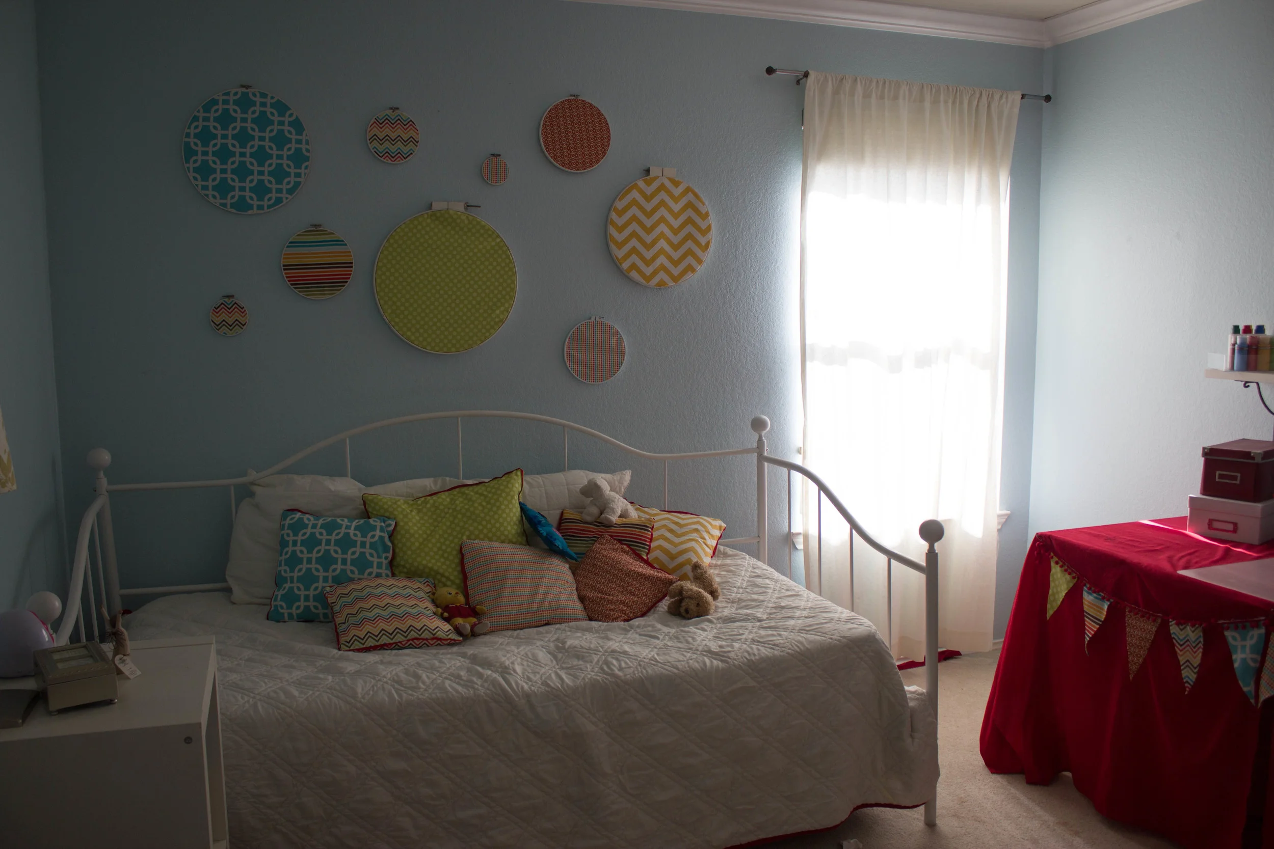
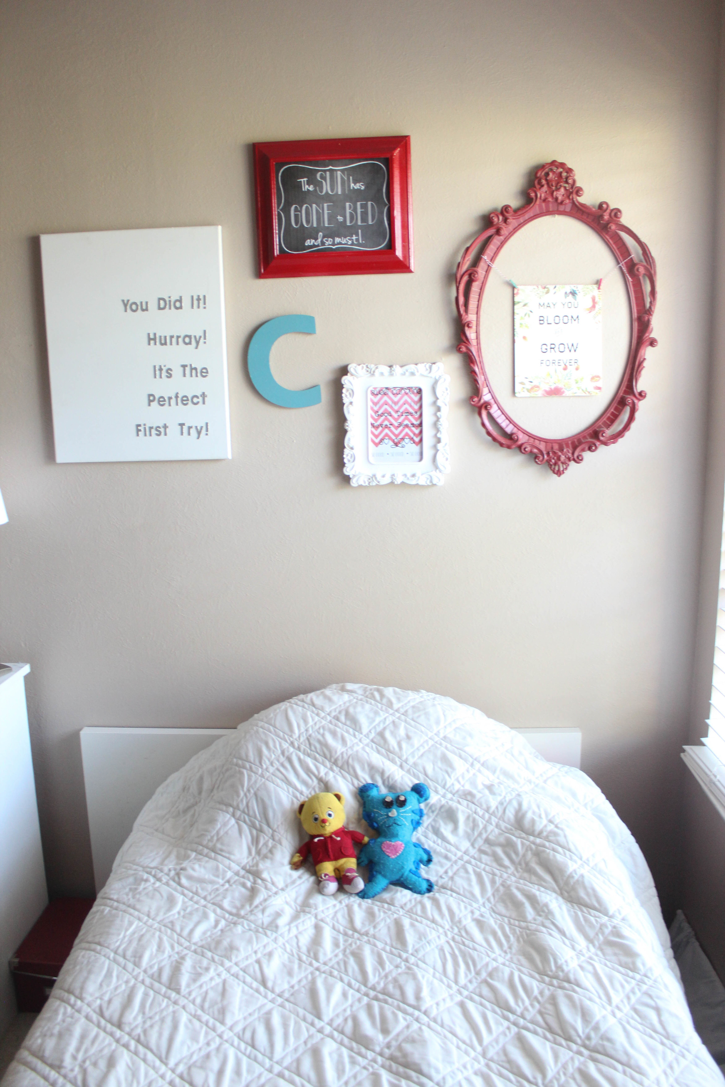
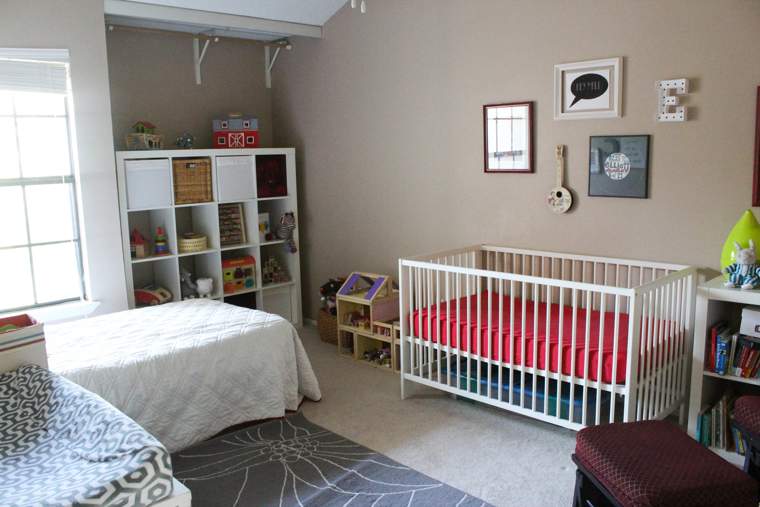
But I knew my "client" so much better this time around! I was excited to bring in some of the cheerful color from her nursery tied into new favorite elements that showed her personality. Like artwork with quotes of songs from her favorite movie "Sound of Music," words we sing to her each night. Or phrases from a favorite story book. A little bit girly with a colorful flair, that's what I wanted my daughter's space to exude. (P.S. Once upon a time I took copious photographs of this space. I was quite proud and wanted to share it. They have disappeared. I am left with this one image. And memories. SIgh.)
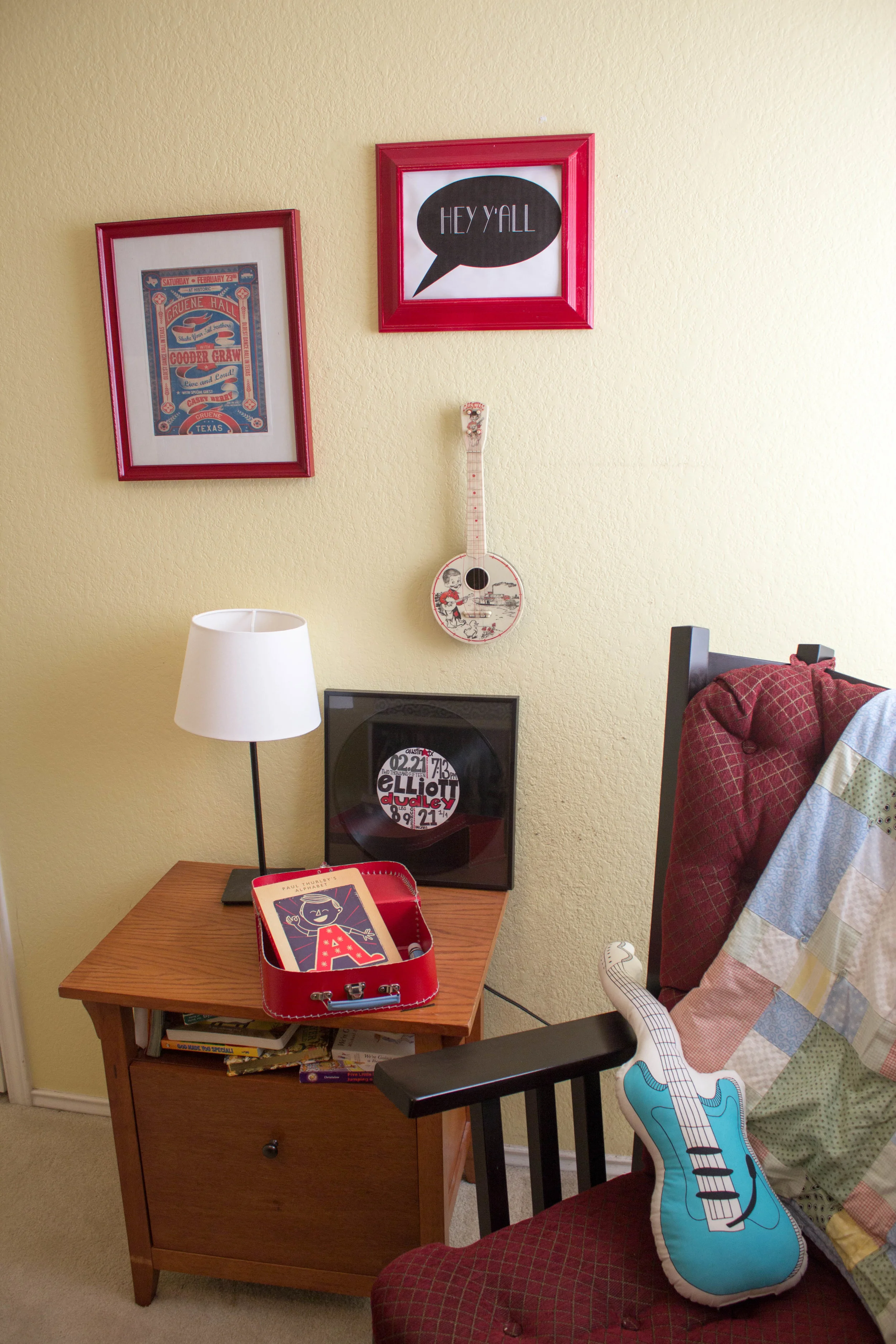
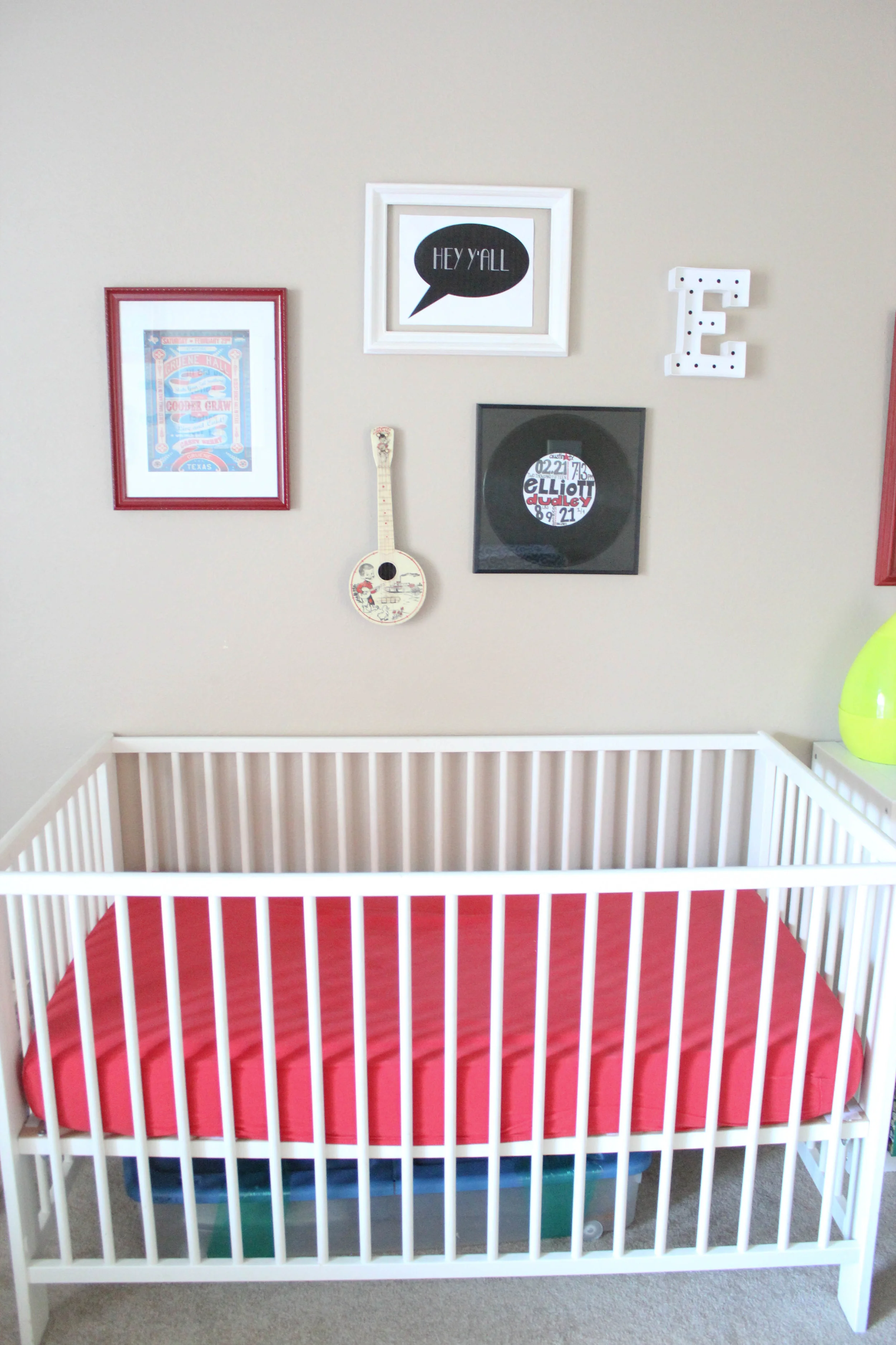
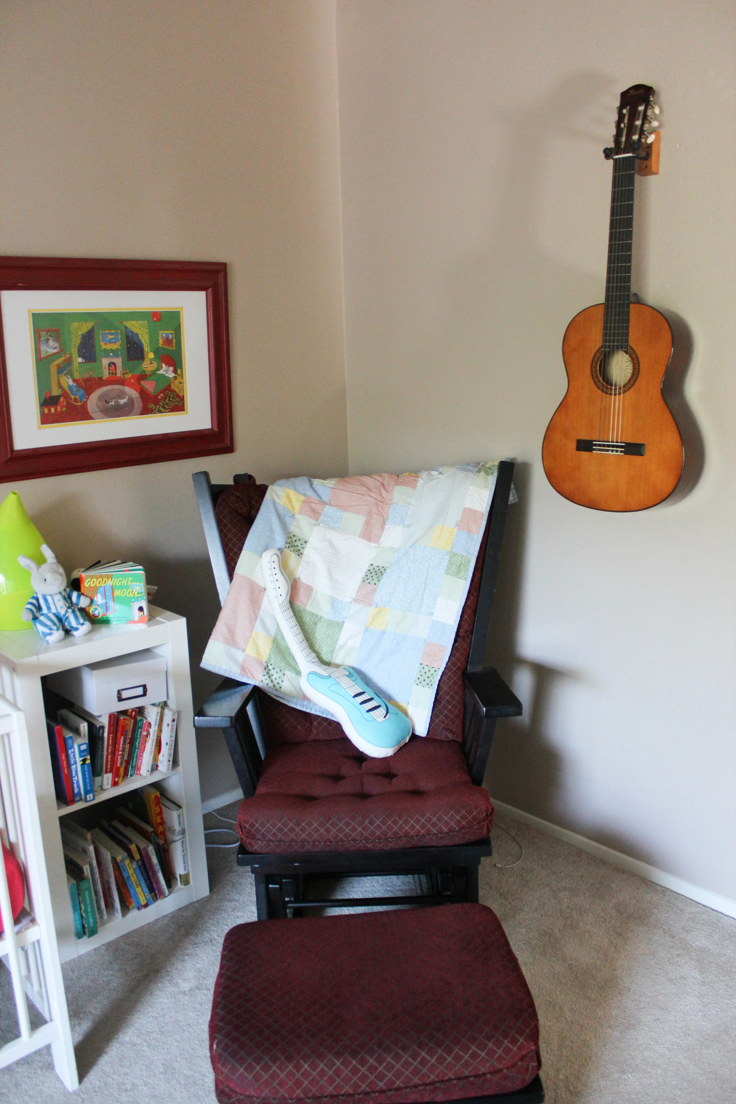
Once we had her space set up, I couldn't resist adding a little something to her new brother's room. Since we would be bringing home our first Austin, Texas baby, I picked some funky music related elements to reflect that "Keep Austin Weird" vibe. (Also seen in this room is the mobile his sister helped me design. More about that later this week!) He may turn out to be a preppy sports kid as he grows, and that's fine. But until he starts to share his personality like his big sister, I'm just going to have fun with what I want.
So when we moved ourselves into a two bedroom home, not only did I have to figure out the logistics of a baby toddler share space, I also had to merge their personalities into one cohesive space. Here are some strategies that helped me tackle this:
- The furniture we have is all pretty neutral, mostly all white. This allows for a blank canvas to add personality and pops of color with fabric, art and toys. Also each piece complements one another instead of feeling mismatched.
- Use a few similar colors throughout. We did this with red (my signature color) and aqua and then more heavy on the white and black. I have more visions of white and black incorporated in this space, but as I have mentioned countless times before, I'm not waiting until its perfect to reveal.
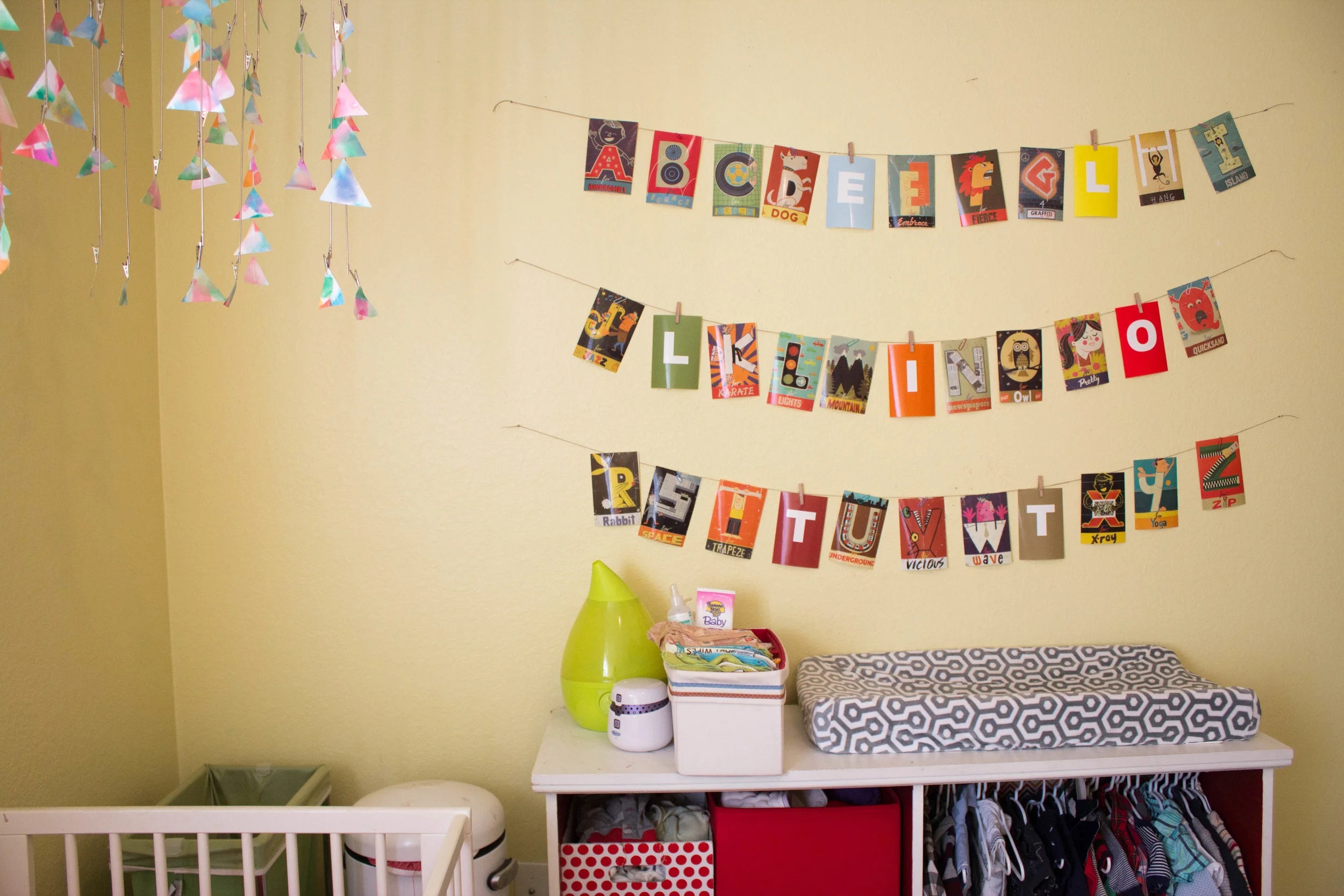
- Gallery walls, while SO in (or are they out now? I'm not always at the head of the trends), they are also a fun an easy way to incorporate each child's individual personality. I love the letters over their beds and the different colored framed prints. And I didn't buy a single print. Just a little Word art and printer action. Free art is the best kind for a kids room.
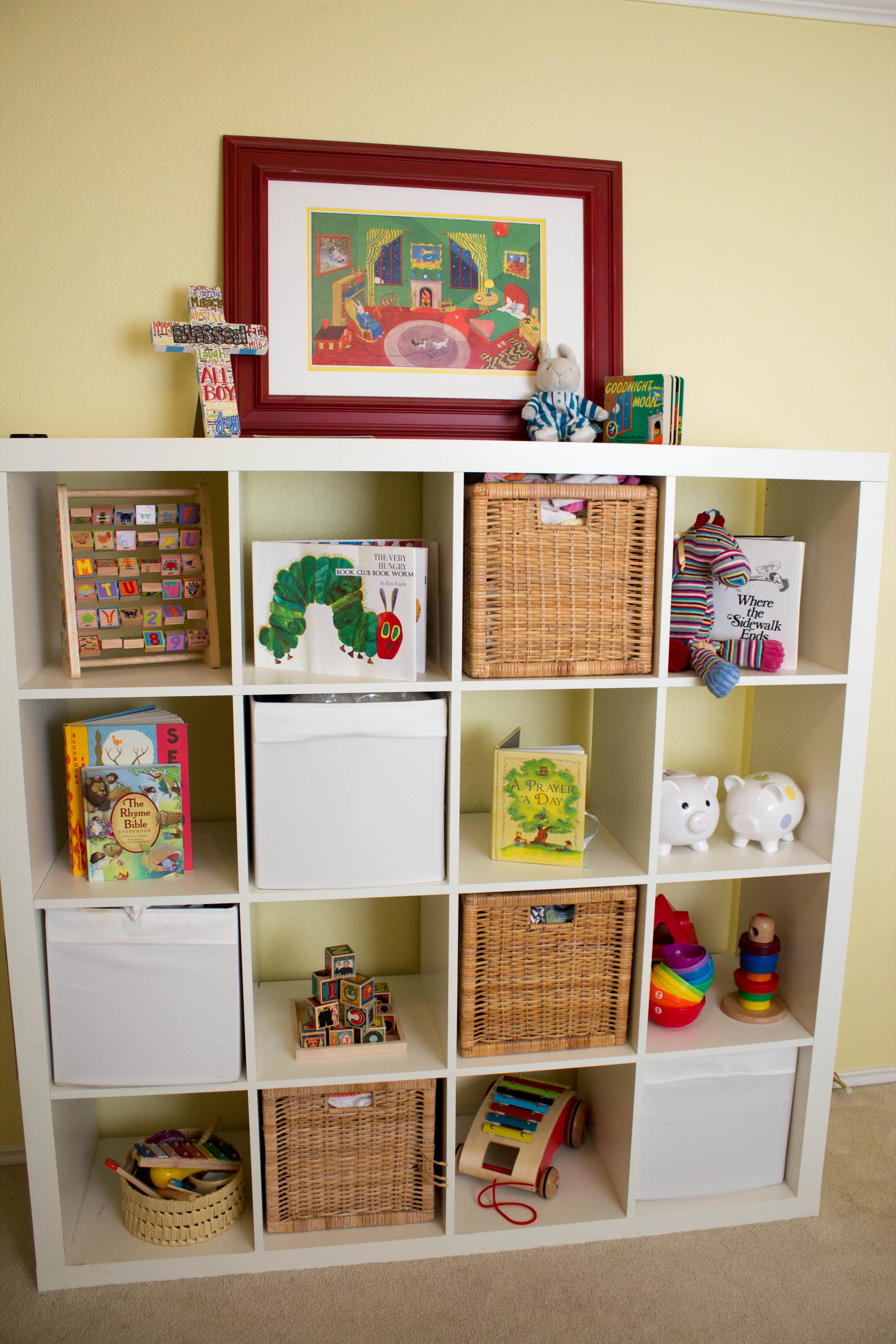
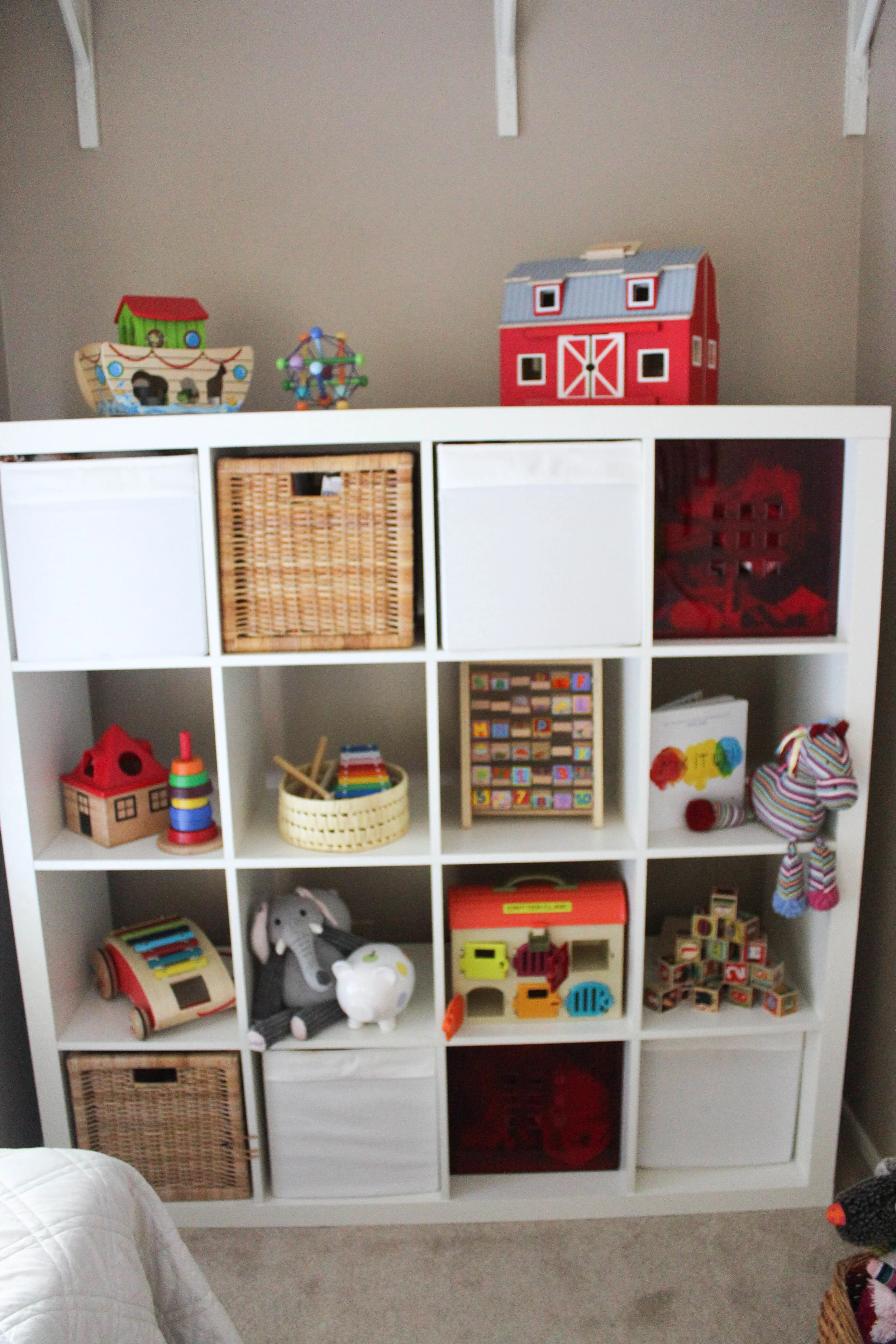
- Decorate with toys. This is not necessarily a shared space suggestion, just my all time favorite use of kid decor. Kid toys, when not plastic and commercialized, can be such works of art. Colorful, classic, whimsy, all elements I think are key to a child's space. And what's great about them is they are neutral for either girl or boy and for any age. Having big shelving units like that also allows for changing out the toys inside as the kids grow up and have new interests. I imagine some cool lego creation or paper mache getting gallery time on those white shelves one day.
- Simplify clothes storage. I have some of their clothes all in the same bins together like pajamas, socks/hats/shoes, and hanging clothes. There is no need to separate when their laundry all goes together and they are basically getting dressed at the same time.
These tips and tricks only touch on ways we have approached a shared space from a decor and organization standpoint. There is so much more to say on how we have tackled sleep and other routines. But that is probably another post for another day.
Overall, I am so thrilled by our decision to have the kids share a room. It was fun to discover how to take two different rooms and personalities and blend together in one space. I feel we have been able to create a space that is both together and individualized. What a great message to send to our kids: You are both unique and amazing creations but we are all in this together!

